
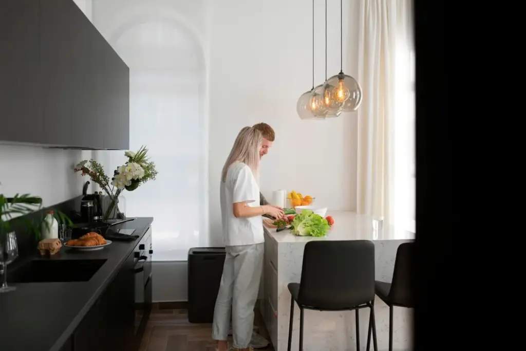
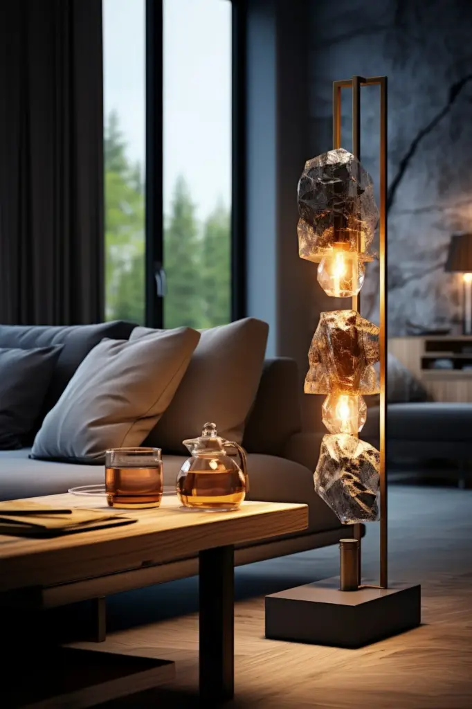
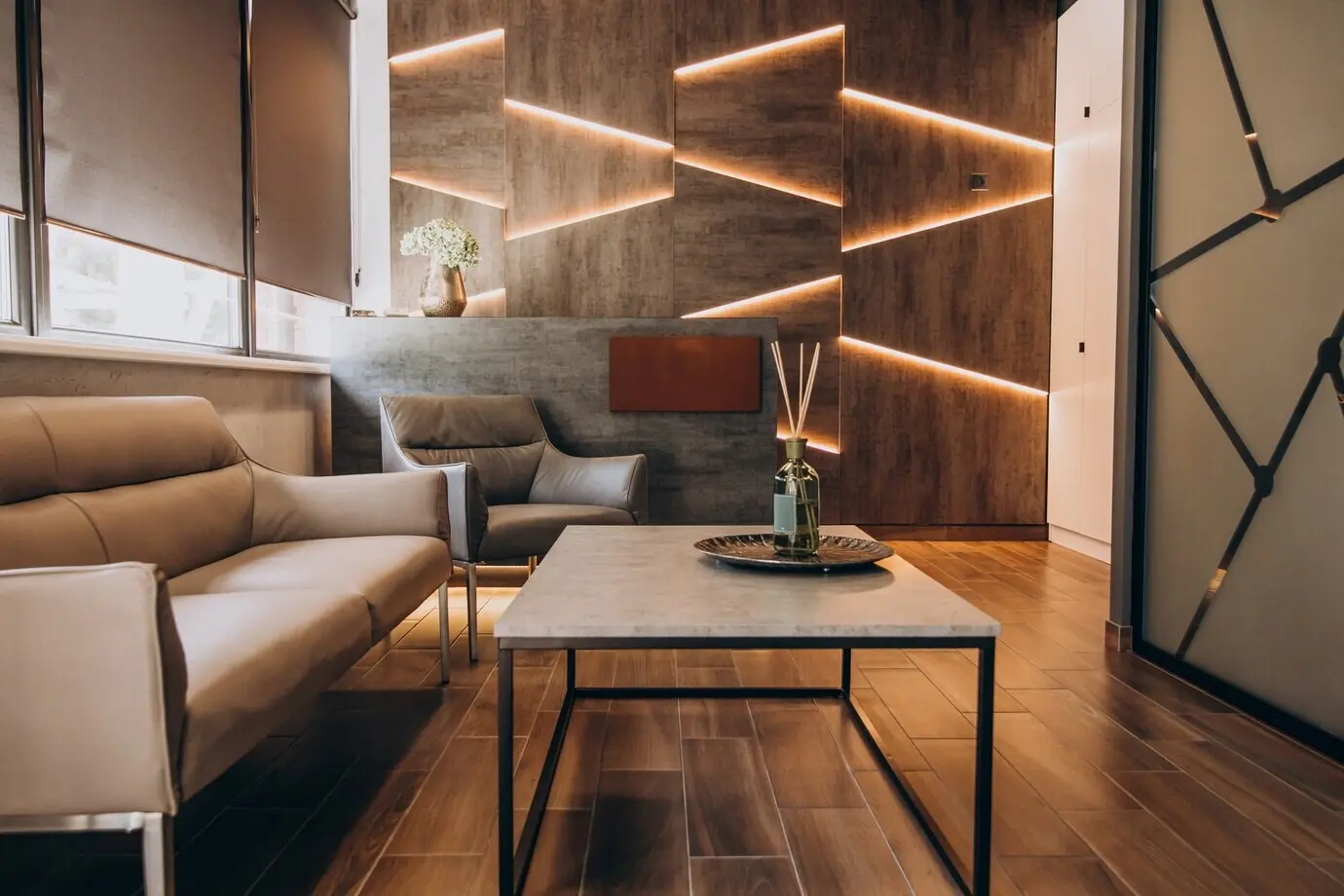
Target 2700–3000K in living areas for buttery warmth, 3000–3500K for active kitchens, and cooler only where crisp focus matters. Blend gently by location, not randomly. Shifting too far within one space unsettles perception, while coherent warmth calms conversation, deepens wood tones, and flatters faces during long evenings.

Look for CRI 90+ when color matters, especially near artwork, wardrobes, vanities, and dining tables. High fidelity protects subtle finishes and natural complexions, preventing that flat, grayish veil. It also builds trust, because ingredients, paint samples, and textiles appear as intended before you commit to choices.

Unify color temperature between adjacent rooms to avoid jarring thresholds. If a hallway glows amber while the living room turns icy, the eye keeps adjusting and never rests. Choose a house standard, then deviate intentionally in task zones, keeping dimming available for nuanced day-to-night transitions.
Divide by activity and surface, not just by room. Reading chairs, counters, artwork, and circulation paths deserve independent control. This flexibility invites intimacy during quiet hours and brightness when guests arrive. Personalized dimming curves also reduce eye strain while preserving sparkle on glassware, metals, and glazed ceramics.
Name scenes for behavior, not nostalgia: Wake, Cook, Unwind, Company, Movie. Each saves dimming levels and color temperature targets that evolve through the day. Use motion or schedules sparingly to avoid surprise. Manual override is essential, keeping control tactile and reassuring for every age and visitor.
Prefer open standards, replaceable parts, and locally stored automation so scenes still work if the internet falters. Verify dimmer compatibility with LEDs to prevent flicker. Label circuits thoughtfully. A clear map today protects tomorrow’s upgrades and keeps maintenance simple when bulbs, drivers, or fixtures eventually change.
Look for sandblasted acrylic, etched glass, or double-shaded designs that scatter peaks. These techniques maintain adequate brightness without visible diodes or pinpoints. The payoff is soft contrast across faces and fabrics, creating photogenic rooms where conversations linger and eyes do not unconsciously retreat from overlit corners.
Choose drum shades for modern calm, pleated for tailored warmth, and empire for classic proportion. Linings matter: gold deepens, white brightens, black focuses. Slightly oversized forms feel luxurious. Correct opacity hides hardware while allowing a flattering halo that smooths skin tones and enriches natural materials around seating.
Paint ceilings a gentle matte and place lamps near light-colored walls to multiply output without extra watts. Brass, alabaster, and glazed ceramics introduce warm reflections. Even simple shelves can become bounce planes, pushing glow deeper into the room and softening shadows beneath artwork and cabinetry.
Choose swagged pendants on hooks, clamp lights on shelves, and picture lights with cords disguised as trim. Color-match cables to walls. Foot-switches and in-line dimmers keep access easy. These moves shift the mood from rental to retreat, respecting budgets while achieving layered nuance and practical resilience.
Bounce light off curtains to fake a larger window, wash corners to dissolve edges, and keep the ceiling brighter than the floor for lift. Mirrors placed near lamps multiply glow. Paired lamps flanking a sofa stabilize composition, making a compact living area feel gracious and quietly upscale.
LEDs fade before they die, and drivers can introduce shimmer long before a blackout. Keep spares on hand, match specifications exactly, and retire mystery bulbs. Early attention prevents headaches, ensuring scenes behave consistently and your home’s glow remains elegant rather than unpredictably harsh or strangely dim.
Fingerprints, dust, and cooking film quietly steal lumens. A monthly microfiber pass on shades, glass, and switches restores clarity. Unplug before cleaning. Avoid ammonia on brass. These gentle habits preserve diffusion, reduce glare, and keep color rendering faithful, extending the life and beauty of carefully curated layers.
Calculate watts per square foot, then trim with higher-efficacy lamps and dimming. Spend on pleasant sources, not sheer lumens. Track utility bills after upgrades to celebrate results. Subscribers often share inspiring numbers; add yours, and ask questions, because collective experiments help everyone refine comfort without sacrificing elegance or sustainability.